


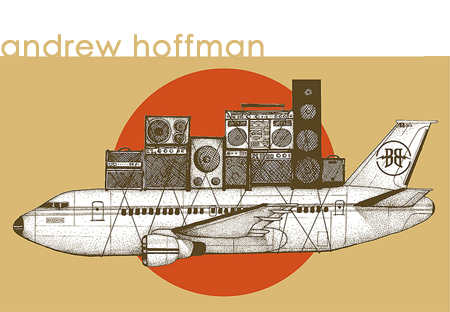
{enter gallery above} Those who work with Andrew Hoffman during the day at the design studio call him an artist. His nighttime, painterly friends refer to him as a designer. Either way, hes not too concerned. For the Colorado native, design and art are only percentages of his life. Just look at his work his design or his art and itll tell you a lot about the diversity of who he is and what he does. Because he does lots of things: he travels. He is a runner. He plays basketball. Skateboards. Screenprints shirts. Draws. Paints. Teaches. I like the combinatorial outcome of Andrew Hoffmans life. What he creates on paper, on a blank canvas: its clean. The objects seem to possess an understanding of the space around it. Often, its playful. And its all probably on account of the fact that his art is based in design theory. And, his design is based in his art theory. Its all about spatial relations. Computational geometry. And lots and lots of his and my favorite thing: typography. Letters in paintings. Words on canvases: I enjoy this done well, but nearly in any manner - especially when it informs the piece. But Hoffman manages to pull it off with more precision. As though he used a drafting table. A ruler, and not only for straight edges. These letters, these word forms are playful, they bare their importance to the composition as much as the ink does. He was raised in Bailey. Went to school in Gunnison. Then he came to Denver to work in an ad agency. He toughened his hide. Received some more schooling for fine art. Began conceptualizing. Boxcar from Andrew Hoffman on Vimeo. Hoffman does things like: shop for domain names at work and then, once the discovery is made: Nobody owns Denver Clothing Company. Maybe I should buy it. Then: I guess I should do something with it. So, what he did was decide to print limited-run shirts. 25 at a time. No Coast is one of those shirts.Its a love letter. All of his work: a love of letters. Theyre everywhere. Alone, a single letter is the most abstract thing we own as a culture. Strung together and its the most commonplace thing we share, together. Even for the pedant, Hoffman makes language fun again. He reminds us of how beautiful each character is. How its presence is violence and impactful, changing within a space. Extending this even further, he adores the traditional sign painters you know, the ones that painted on sides of buildings. Those old signs a couple flakes of paint away from their hundred year old death. His chopping block piece: that axe in the bleeding stump - is painted all with sign painters paint. Brilliant, even if nobody else needs to know that. His Hoop Dreams is a commentary on that undefined space between your late-adolescence and becoming adult; that day you realize how sore you are after playing a pick-up game realizing how youre getting older now and how weird that is to conceptualize while looking at your Air Jordans. Hoffmans not much into Artist Statements. Luckily, his work speaks for itself. Maybe its the letterforms, but mostly its his whimsical sense. The fact hes not too rigid at any turn. His joke, his idea is cut from that advertising background: be clever, but clear. Get your point across and walk away. Give them something else, another time. Because everything is only a percentage within him, Hoffman has grown a tough skin. Dont like his art? Fine, he does commercial design and is obviously good at it. Think hes taken some lame jobs? Well, hes a working artist and to live a deliberately creative life, all while articulating the joys that you have created is a virtue of the highest caliber. |