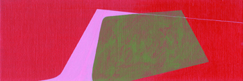


{karen mcclanahan} enter gallery here On one level Karen McClanahan is merely working with your run of the mill characters: color, light, space, depth, shape, texture and composition. On another level she is dealing with everything so obvious to your daily life it is profound. To enjoy McClanahans work, or a painting in general, you dont need to know about epistemology or architectonics. And we all know that only one sensory faculty is utilized in perceiving a painting. But if you want to know why Karen McClanahans work is both relevant and fascinating, you may want to reflect on your cognitive processes and the idea of perception just a little. Perception is typically defined as the process of acquiring, interpreting, selecting and organizing sensory information. This intake of information through the visual system is what we use, in large part, to plan actions and place emotive values on the world around us. This is not to say that you need a research team to help you locate beauty, symmetry and a sensation of familiarity in McClanahans work. Because, clearly, you dont. Her work stands on its own apart from any intellectual deconstruction. But her work also begs one of the grand conversations in all of art: the want and need for information, juxtaposed against the denial of it in gradients. McClanahans major 2006 show at Plus Gallery, entitled Pitch Shift engaged everything cognitively explicit and implicit at the same time. It was a body of work predicated on those most fundamental elements that you and I interact with, and then utilize in our daily living cycles of perceiving the world and navigating our way through it. And while McClanahan is aware of all this Im not so sure this is her ultimate aim: an illumination of the basic qualities of our visual preceptors. She is more interested in creating paintings that satisfy her desire to skew these fundamental elements. However, on another level McClanahan is acutely aware of all the implications and tendencies. To this end in Pitch Shift, she paired her works carefully, with several drawing elements; sometimes enlarging them from other pieces in the same body. With Pitch Shift, McClanahan was interested in creating a three-dimensional space, instead of separate two-dimensional pieces that only loosely, or conceptually, bear resemblance to the other pieces. This is not to say that McClanahan drew a storyline between the different canvases. She did, however, employ her characters as the through-line. With this simple, yet complex mechanism she achieved a glorious amplification all those fundamental facets we take for granted: color, light, space, depth, shape, texture and composition. Karen McClanahan is a colorist. And while she is working on becoming even stronger in this facet, she is already highly adept. After all, the emotive elements of her pieces are predicated on her color selection. Moreover, the sensation of depth in her work as well as the space she creates is also heavily reliant on her choice and use of color. In her work are certain shapes. However these are not forms that you will readily recognize. In her previous bodies of work, she found viewers looking into the organic shapes within her canvases and finding images of birds and animals and everything anthropomorphic. Now she is intentionally straying from that. While the shapes in her paintings are curvilinear, they are not identifiable icons. One method that helps her push further from the familiar shapes of our inherited world is to constantly turn the canvas as shes working on it. For McClanahan this is, in part, a way to push herself. As you can imagine, at first, the new vortices feel uncomfortable. But in her quest of creating something entirely unnamable, she walks away from her work returning later to see if the same opinion stands. In the end, McClanahan is interested in exploring that element of discomfort. To get locked into one mode of looking at anything is unhealthy and what better way to move your notion of perception forward, than to create a slight discomfort within a grand balanced design. To further clarify McClanahans work is to also explore a notion like honesty - and being honest as an artist. For somebody producing the kind of work she is this is a tricky, but wildly illuminating, notion when compared to a painter of portraits, especially self-portraits. The issue of honesty is a transferable notion. One that McClanahan learned in graduate school. If you are honest in your work, a professor said, then you will find the correlations of your work in your personal life. Once again, this harkens back to McClanahans characters of color, light, space, depth, shape, and texture. Look around her living space and you are certain to find hard elements of design and order, and balance the same elements her work is contingent upon. For this reason, McClanahans work is honest. Furthermore, anybody battling the notions of relevance reread the first paragraph of this article. Her work is relevant. And powerful. Now living in Arizona, McClanahan is a Colorado artist, still. Her representative gallery, Plus Gallery, has just sold-out her last body of work and awaits more. With her strong work ethic and even more progressive upcoming body of work, I would recommend staying in touch with her and her future shows by visiting Plus Gallery: Karen McClanahan. |


